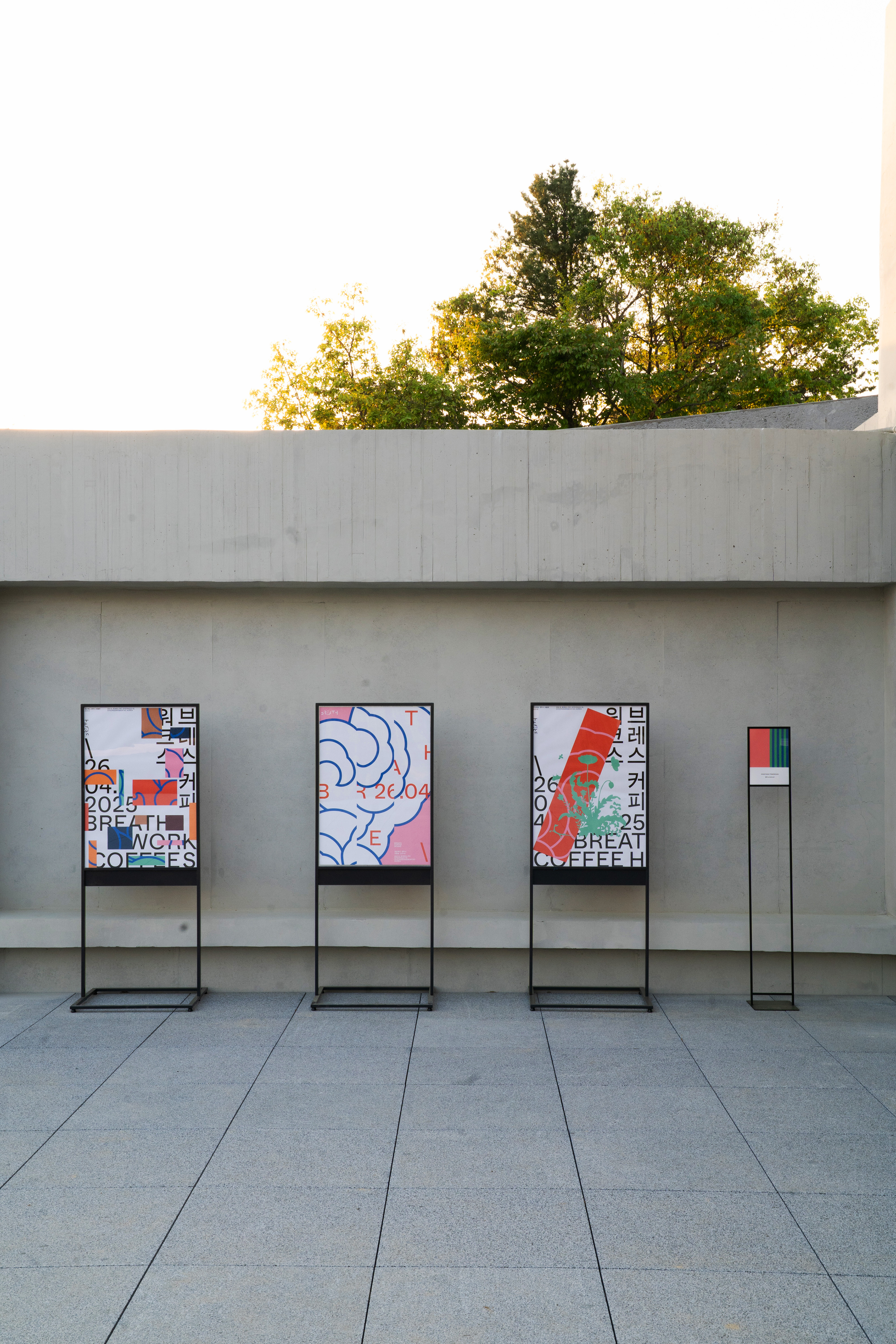
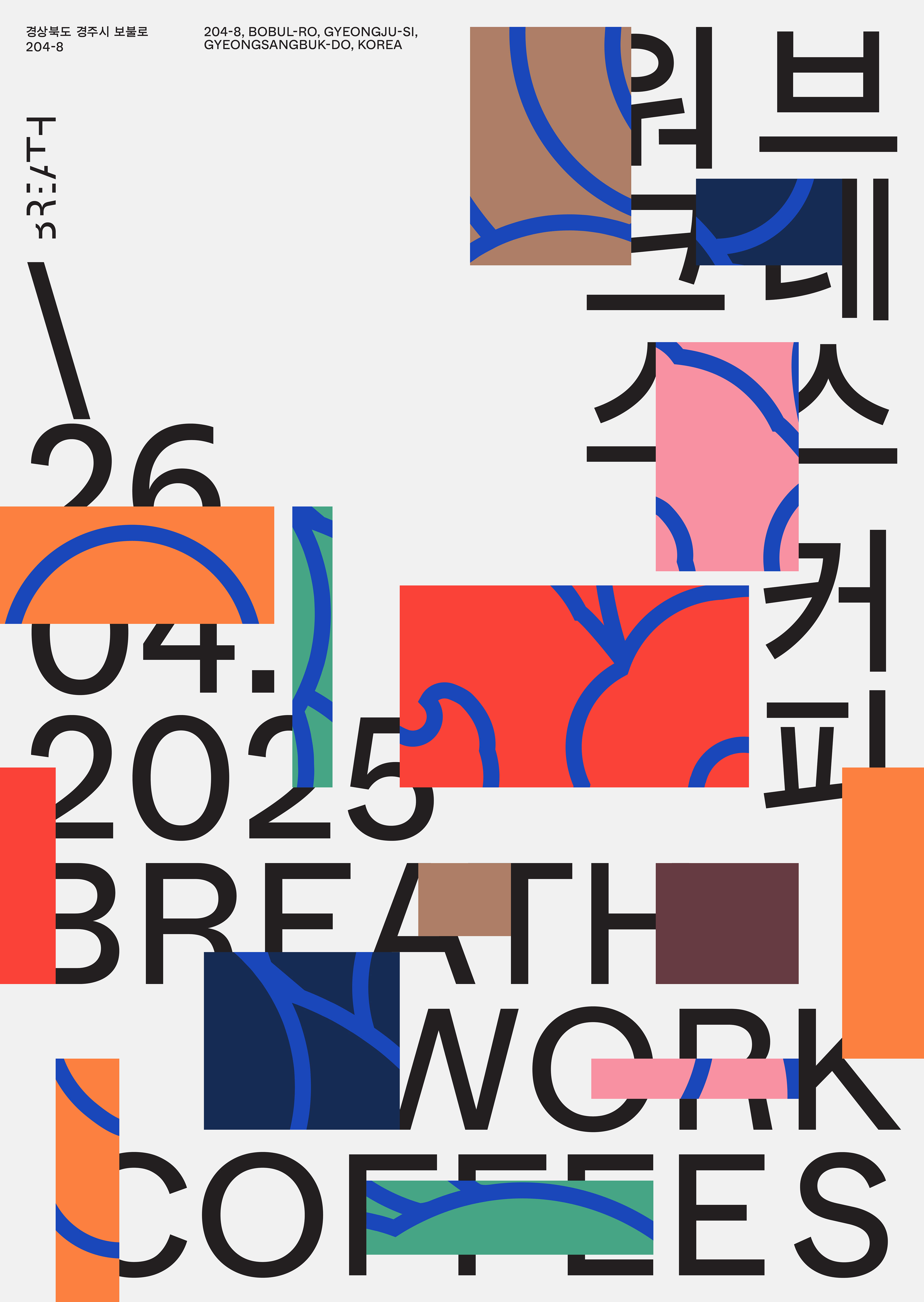
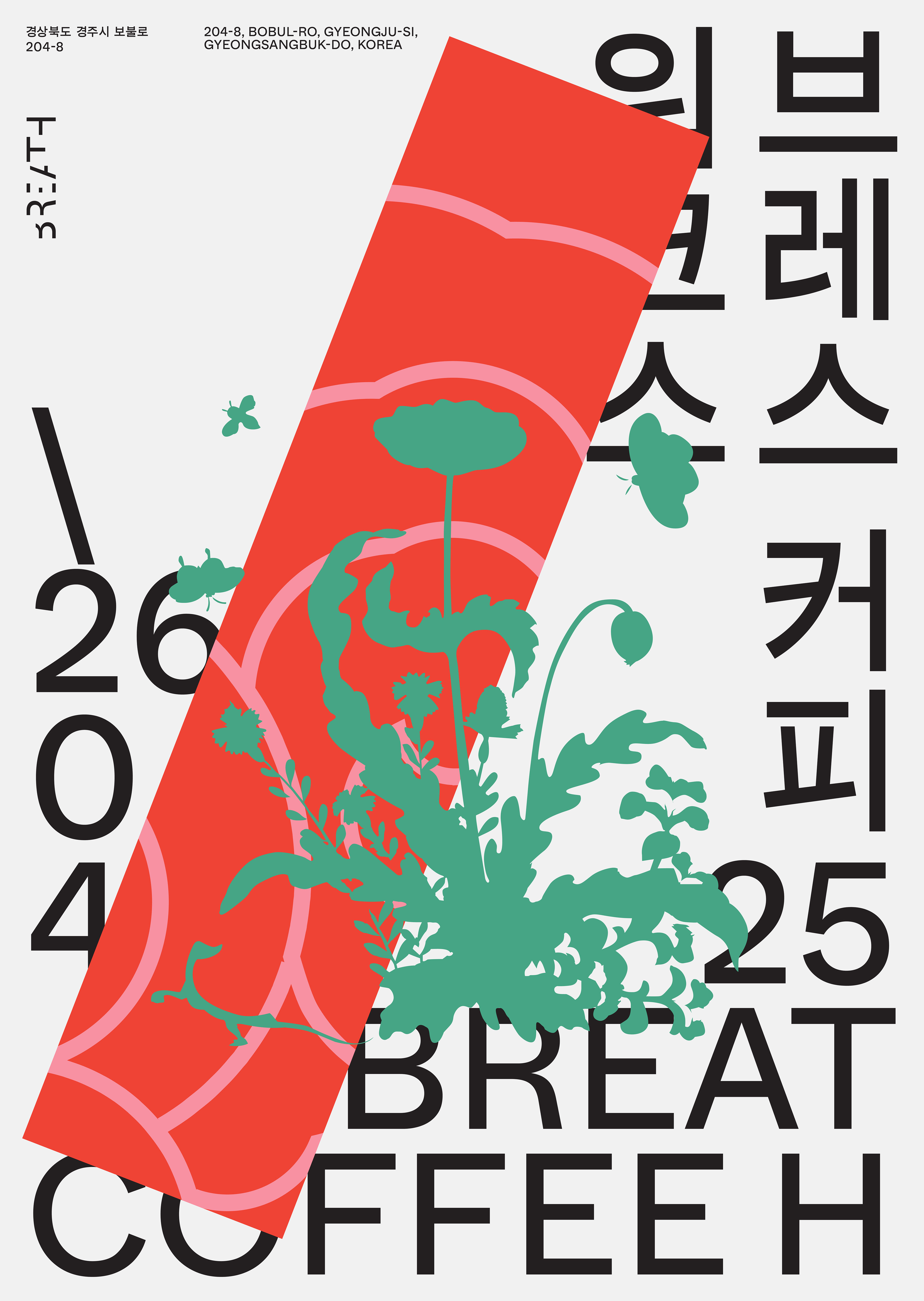
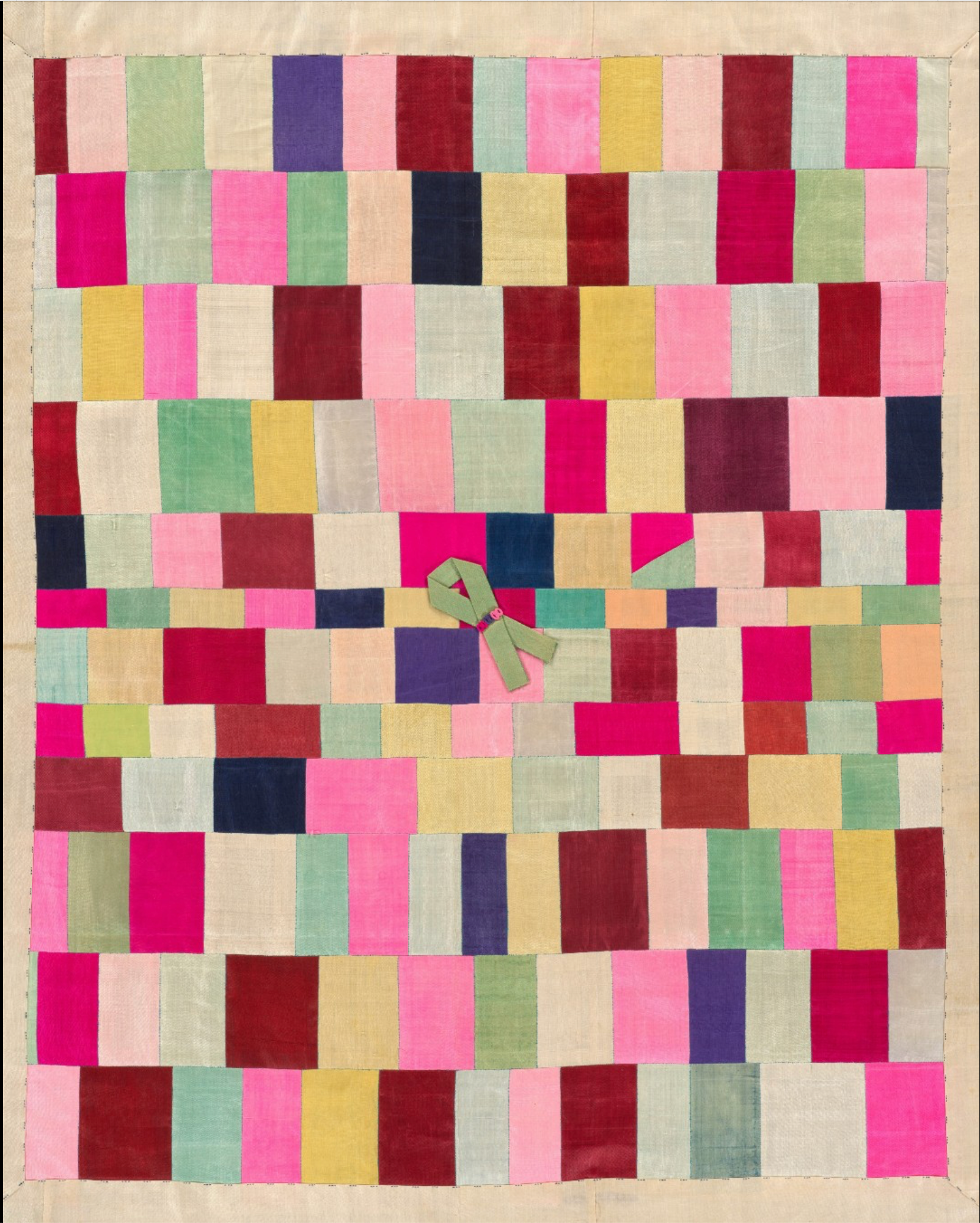

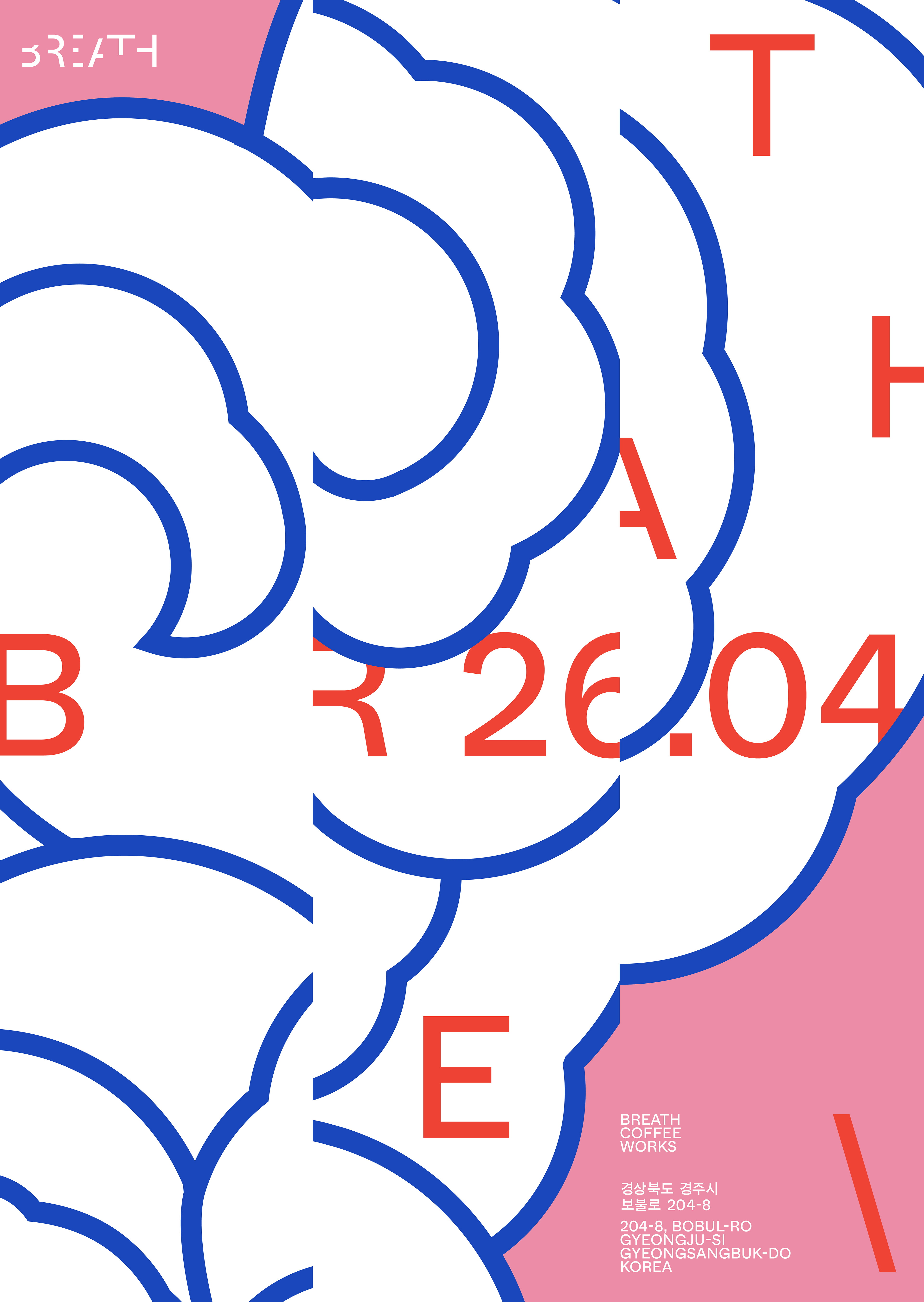
Happy to share a tiny bit - the posters - of a recently completed project called «Breath». It all started with an accidental chat over a coffee in Gyeong-ju one year ago during my trip in S Korea, and here we are! The client had an exciting vision: a coffee cum roaster in the middle of nature. The task was complex and fascinating - create something modern and cool, while at the same time keeping the Korean heritage element. I also had to take into account the key nuances of the place - its architecture, surrounding landscape, and interior design solutions. So, I immersed myself in Korean culture and its vibe. Much research and many conversation later, we found the core graphic identity of «Breath» - Jogakbo* as main principle for the brand system. Jogakbo becomes the patchwork for typography, logo cloud pattern and colour palette. Thank you Min Seop, through this journey your vision has broken many barriers and brought talented people together. Font in use: Whyte Hangul & Whyte by @abcdinamo Photos make by: *Known as a jogakbo, this type of wrapping cloth is made of small pieces of material stitched together. This modern work maintains a tradition of patchwork textiles that were popular during the late Joseon period, when they were produced by women of all social classes as examples of creative thriftiness. The cloths would have been used to bundle items, wrap gifts, or cover plates of food. Wrapping cloths continue to be made today, either as mass-produced utilitarian objects or as handcrafted artworks.